Tuesday, March 27, 2012

New Frosted Designs Sketch Challenge

Well, I'm a little late in posting this. Sorry everyone. I've been a blogging maniac lately and this one just slipped through the cracks.

There is a new sketch challenge going on at Frosted Designs. I made this card for Card Sketch 15 using the sketch in the photo below. The image is from Digi Doodle Shop, who happens to be this week's sponsor. I colored the image with Copic markers. I love Copic markers! They make an amateur like me look good.  Now it's your turn to play. Go to the Frosted Designs page and post your project. The winner gets a $10 gift card to Digi Doodles Shop.


Game Day by Annette Witherspoon

Card Sketch 15


 Enter your project by noon, Sunday, April 8 to win a $10 gift card at Digi Doodle Shop!!


Monday, March 26, 2012

Pink by Design Spring Blog Hop


Hello everyone. It is officially spring. Although, in Ohio, it's been feeling a lot more like summer. We've been setting new records with highs in the mid 80s. However, today it is in the 40s. My poor closet is confused!! One day I'm wearing short-sleeved shirts and capris, and the next day I'm sporting a sweater and jeans!

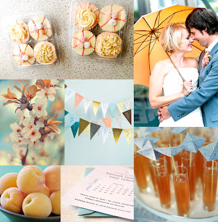
Personally, I prefer the 80 degree temps. Can you just feel the warm weather with a nice, cool breeze! It's perfect weather for flying a kite, which brings me to the card I made for the March blog hop. (See how I worked that transition from the weather to my card?) Anyway ... The light blue and orange colors served as the main inspiration for my card. I love the color palette. According to Pantone, tangerine is the in color this season. I can see why. It's a bright, cheery color. I also pulled a few other elements from the inspiration piece. The banners have pretty patterns and the light blue sky in the background. My card also has a kite made of pattered paper against a sky. You'll see in the lower center square of the inspiration piece a save the date card with brackets. I followed suit by surrounding my sentiment with brackets. 


Speaking of sentiments, I used the Pink  by Design Subway Art set. Although the set was designed to make subway art with multiple sentiments, each sentiment in the set is an individual stamp. How versatile! You can use it for subway art or as in this case, as a stand alone sentiment. I love versatility!!

This is the last stop on the hop. Thanks for hopping along with us!! If you came to my page another way, I invite you to join in the fun. The lineup is below.

Now it's your turn to create a spring-inspired card  using the trendy wedding photo as your jumping off point. Create your project and link it to the Pink by Design blog. You have two weeks to do it!!


Pink By Design Blog - http://www.pinkbydesignstamps.com
Annette - http://www.aspoonfullofsugarcrafts.blogspot.com/   ←You are here!
Pink By Design Blog -  http://www.pinkbydesignstamps.com


Miss You Aunt Hazel

Hi everyone. Today I'm posting a card I made a week ago for the Moxie Fab World Trigger Challenge. When I made this card, I had no idea I would be dedicating to my Great Aunt Hazel. This morning, Aunt Hazel left this world to be with Jesus. I'm sure everyone in Heaven is in stitches right now because Aunt Hazel was a hoot. Although she is biologically my great aunt, she was really more like a grandmother to me. She lived with my mom and my maternal grandmother, all of whom are widows. I often fondly referred to the three as "The Golden Girls." I am so blessed to have gotten to know Aunt Hazel over the past 15 or so years. You couldn't help but be drawn to her fun-loving spirit. I will miss her, but I take comfort in knowing I will see her again in Heaven, where we will laugh together again. Goodbye Aunt Hazel. Thank you God for blessing me with the opportunity to get closer to her.

I drew a lot of inspiration from the photo. I love the damask pattern on the rug. I used my L Letterpress to create the damask pattern on my card. I also love the dark wood floors in the picture. The floor, the soft, muted colors, as well as the chair and lamp in the photo are reflected in my card. The title of the Trigger Target is Simple Elegance, which is why I decided to keep my card clean and simple, yet draw in some of the elegance from the picture.

Thanks for looking and God bless.


Trigger Target: Simple Elegance

Sunday, March 18, 2012

Pop-Up Card Tutorial

Hi everyone! Today I had the honor of posting a tutorial at Frosted Designs. I made this cute pop-card. It's really not as complex as it looks. If you're interested in learning how to do it, check out my post here!

Inside

Front

Wednesday, March 14, 2012

RIC #7

Today, I'm posting another card I made for the relatively new Runway Inspired Challenge, a challenge blog that finds inspiration from the latest fashion trends. This time, the inspiration piece came from Anna Sui's fall collection.

I drew inspiration primarily from the colors - vibrant pink, deep red, electric blue, bright orange, and then your basic black and white. I used some modern graphical elements that I recently downloaded from the Silhouette store, and cut them from paper in the inspiration colors. The sentiment is stamped in a serif font similar to the one used in the inspiration piece. The negative space that surrounds the sentiment was inspired by the scallop-shaped clock.


RIC 7
Anna Sui Fall 2012

Tuesday, March 13, 2012

What's on Your iPod?

Today is my turn to show off some of Pink by Design's newest releases. I just love being a DT member. I get to make fun projects using the latest and greatest stamps. Head on over to Pink by Design's blog to check out what I did with their February stamp of the month set called Rain or Shine. I combined it with another set called LOL to bring you a fun fabulous card. Want a hint about it? Read the headline. Want another hint? Check out the photo below. Wanna see the whole thing? Click here!


My Debut at Frosted Designs

Hi everyone!! I am so excited today because I get to share my first project as a Frosted Designs team member. I am on the card sketch team. We host a  sketch challenge every other Tuesday and the winner gets awesome prizes. If you haven't checked it out yet, I highly recommend you hop on over there. It's a lot of fun. I mean, helloooo!!!! Awesome prizes!!

Here is my card. I just got my hot little hands on the Gnome Sweet Gnome set by Lawn Fawn, so I couldn't resist using this little guy. He's a master gardener. You can see his beautiful flower garden. He waters it daily (except when it rains.) He's a really sweet little guy. His name is Chirpy Flatfoot. Wanna know how I got his name? I found a gnome name generator online, typed in my name and got Chirpy Flatfoot!! Ha ha ha!!!

Oh, and today is a two-two past day. You're reading post one. Check out my other post for Pink by Design! Have a great day!


Card Sketch 14 by Ann Bacon

Friday, March 9, 2012

Liebster Award

Hi Everyone! I am the recipient of my first ever blog award. My blogging buddy Melisa Alzhammar gave me the "Liebster Award".  Thank you, Melisa, for giving me this award! You're awesome!

Here is a little information on the award:  "Liebster" is German for "Dearest".  The award is a "Share the love arrangement", given to inspirational bloggers with less than 200 followers. 
Here's the to do list for any of the Liebster Blog Award recipients. 
1. Thank your Liebster Blog Award presenter on your blog. 
2. Link back to the blogger who presented you the award.
3. Copy and paste the award on your blog. 
4. Present the Liebster Blog Award to 5 bloggers with less than 200 followers. 
5. Let them know they have been chosen by leaving a comment on their blog. 
Here are my 5 choices with less than 200 followers. 
Please visit them and leave them some love. 


Friday, March 2, 2012

Runway Inspired Challenge #6

Today I'm playing in the Runway Inspired Challenge #6. This week's challenge features designer ware from Maxime Simoens Spring 2012 Couture.

I was inspired by the black and dark grays against the white and pink checkers and the shimmery textures. To keep the design as CAS as possible, I made a few larger squares instead of several smaller squares, like you see in the photo (below). I wanted to add a little interest to the eye, so I positioned the colored squares a little off center against the larger back squares. I think it embraces the inspiration piece, yet still follows a clean and simple graphical style.

Maxime Simoens Spring 2012 Couture


P.S. Like my watermark? I made it this evening.

LinkWithin

Related Posts Plugin for WordPress, Blogger...